LOUIS BURKE | Culture | CONTACT
An independent report from the Betoota based James Cook Academy of Design (no relation) has determined that if a student submitted the logo of American baseball team the New York Yankees they would probably get a B- at best.
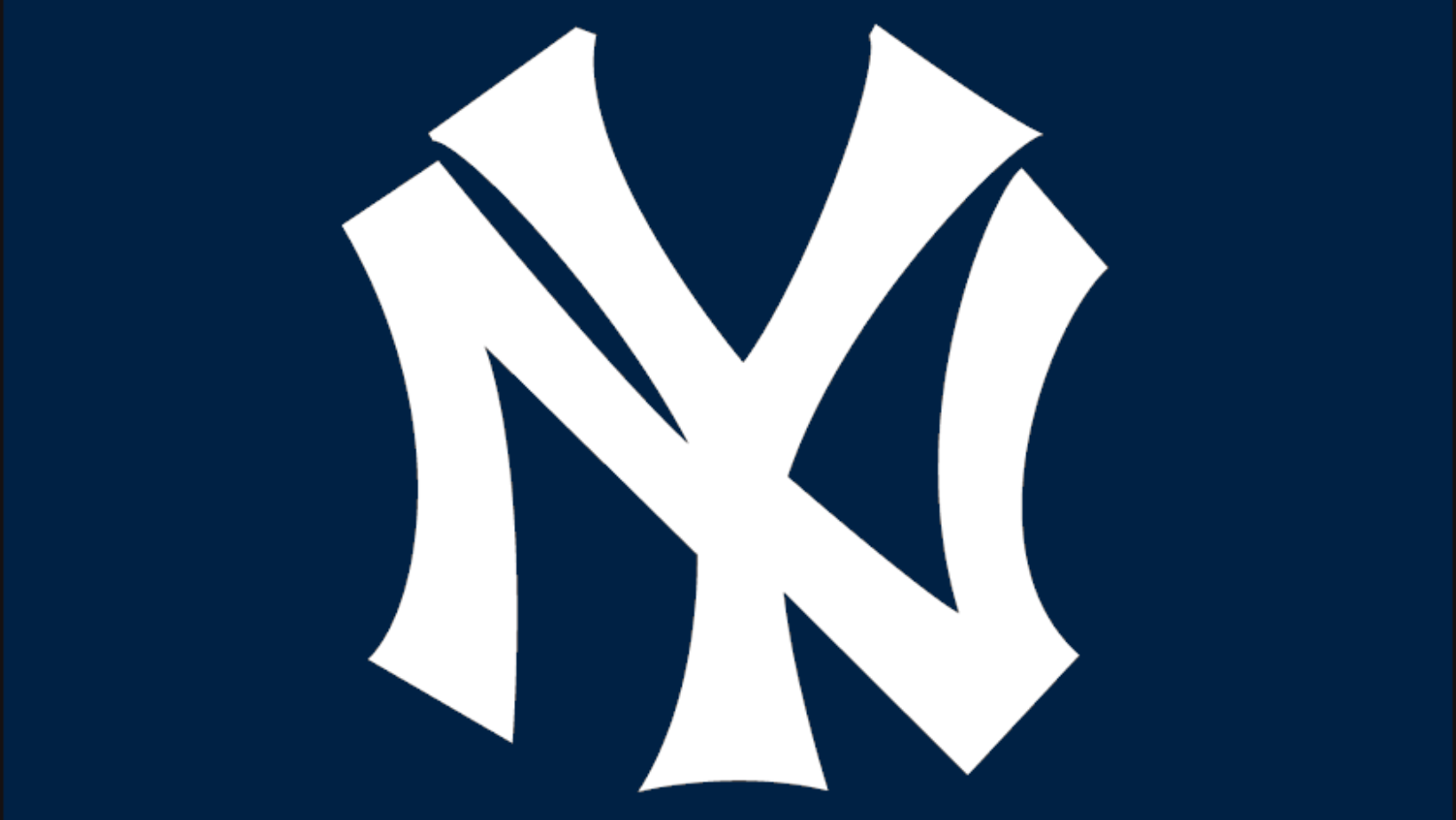
Possibly the most iconic logo of any sports team the world over, the Yankees logo features the letters N and Y laid on top of each other as if they are sharing a character space.
The design was first used by the team in 1913 and has become so synonymous with the Big Apple that the younger New York baseball team, The New York Mets, just went and did the same thing but in a different font.
Aside from being used to identify fans of the Yankees, people from all around the world wear the logos on hats to warn people ‘I am a dickhead and so is my son.’
According to third year professor and head of the Fuck Canva Society, Dana Demitri (44) the success of the Yankees logo is even more impressive when you consider that someone seeing it for the first time would have no idea what it is.
“It looks like a Russian cyrillic character or a crude bundle of sticks,” stated the professor whose office contained a framed photo of a severed tongue that she claimed was an original.
“Once someone points out it’s an N and a Y you’re like ‘oh yeah’ but before that it looks like a partial shoe print made by a chunky S Club era sneaker.”
“Any design that a student has to explain is worth a B- at best.”
We then asked Professor Demitri if she would like to review some Australian sports logos which led her to laugh and politely, but firmly, ask us all to fuck off.


